For my new work, please go to Jessvii Artwork.
The web site is at http://jessvii-art.blogspot.com/.
1/26/12
6/20/11
Where did I go?
So I've been running around trying to plan a wedding on my own for a few months, hence the complete lack of new art. However, the wedding day is soon and the running around is almost over! I can't wait to get back to my art.
2/17/11
Fleming's Class 5: Painting Clothing

- It's impossible to see everything when you look at a person - similarly, when painting a person, don't try to capture every detail
- You don't have to paint a white sweater white or black boots black - you can add some blue to them to harmonize them with the blue shirt
- When painting people, use fewer brush strokes and really blend the strokes together
- The upper lip is almost always in shadow
2/10/11
Fleming's Class 4: Contrast

What I learned:
- Make adjacent shadow areas the same value. For example, when the red shirt meets the brown neck, both tints should be the same value.
- Integrate the figure with the background and do not let the background overpower the figure. Texture, contrast and color attract our attention. If the background is dry brush, high contrast and super bright, then it will detract from the figure.
- Practice practice practice - I've been doing one 5-minute figure sketch each day which helps me draw faster (we only get 20-30 mins per painting in class).
- The joy of using Raw Siena, Burnt Siena and New Gamboge paint for figures. Also, the joy of using my new filbert size 16 and size 4 brushes. Fleming uses round brushes for figures, but I prefer my filberts.
- To stop using Caput Mortum paint on the figure - that color is best left for painting landscapes only.

top: Ready to Leave, ~10x15in
bottom: Byron Sitting, ~9x15in
both watercolor paintings by Jess Sanaie (c)2011
2/3/11
Fleming's Class 3: Faces

- Combine the shadow shapes together, such as the shadow on the side of the face and the one under the chin.
- Find the big shadow shapes. You may need to make the shadow shapes darker than they really are. The contrast turns the figure (makes figure look 3-dimensional).
- Use warmer colors higher on the face; use cooler colors as you move down.
- There's a warm shadow in the following places: corner of the eye, going from side of the nose up towards the eye, the underside of the nose, and above and below the lips. The shadows around the lips are warm because of reflected light (lips are reddish so the shadows are reddish)
1/22/11
Sarah's Dog

Sarah's Dog Mica, 11x14in, Drawing in Charcoal Pencil,
(c)2011 by Jess Sanaie
Iceberg?

Reeves' painting reminded me of an iceberg, so I painted one this morning. I think tomorrow I will try doing something much more abstract, but use similar inspiration.
Iceberg, 8x10in, watercolor painting,
(c)2011 by Jess Sanaie
1/20/11
Fleming's Class 2
 |
| Michael Sitting, watercolor over graphite 14x17in (c)2011 by Jess Sanaie |
- Use more saturated colors - I'd been using really diluted fleshy colors, but when viewed from afar my paintings weren't as good that way
- Paint bigger - The larger I drew the figure, the more room I had to play with color
- Consider painting on the back of the paper - it has less tooth but can make for smoother color-mixing
- When dragging one color towards another, sometimes a brush stroke going upwards (instead of top to bottom) works better
- Redraw some of the pencil marks halfway through, otherwise they can get lost
- The whites of the eyes shouldn't be bright white because they're still in shadow
- Leave more white space on the figure
- Remember to have fun - people can usually look at a painting and tell if you had fun painting it
1/19/11
Bagels are Delicious

Colors used: Titanium White, Cad yellow, Yellow Ochre, Orange, Cobalt Blue, Burnt Siena, Burnt Umber. I used Matte Gel Medium to capture the texture of cream cheese.
Bagel with Cream Cheese, 8x10in, Acrylic painting, (c)2011 by Jess Sanaie
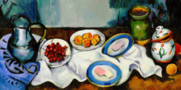
Artistic Influences
I look to other artists I admire for inspiration for my own art. I was reminded of this today by Google's home page image, which honored Cezanne's 172nd birthday. Here are some of my favorite artists.
I Have Boots

Last night I drew them on gray pastel paper. Colors used: white, black, light gray, dark gray, silver.
The boots were splayed out on my bed, insides facing me, when drawn. If I drew them again, I'd put the left boot on the left (here it's on the right) and would flip them around.
Gray Boots, oil pastel, 11x14in,
(c)2011 by Jess Sanaie
1/17/11
Gift for Sarah

Although I usually paint in watercolors, for this I used acrylics. The colors I used were: Cad Yellow, Yellow Ochre, Burnt Sienna, Burnt Umber, Dioxazine Purple, Titanium White.
French Bread and Butter, 8x10, Acrylic painting, (c) 2011 by Jess Sanaie
1/16/11
Practice with Figures


While taking Fleming's class, I'll try to practice figures during the week:
Don, pen drawing (left)
8 Minutes of Sitting, graphite pencil drawing (right)
Both 5x7in and (c) 2011 by Jess Sanaie
1/15/11
Paint What You Love

Thiebaud painted cakes, ice cream, pie and sweets, among other things.
I love sweets such as an ice cream sundae. I am looking to do a hot cocoa series under the same line of reasoning.
Ice Cream Sundae, 11x17in, (c) 2011 by Jess Sanaie
1/13/11
Steve Fleming Class 1
I have signed up for Steve Fleming's The Figure in Watercolors class (class details). During some classes the model will be nude - I will not post the paintings from these classes, but will blog recaps of what I learn, and will try to do clothed figure paintings during the week to practice.
What I learned from Class 1:
What I learned from Class 1:
- Put some of the figure's color in the background and vice versa
- If you use a lot of red to paint figures, they come out looking cold - use warmer, more yellowish colors
- There is always a contour below the check bone and a highlight on the nose
- Pick one side of the figure and make it a hard contour, usually the side being hit by the light
- Use white paper for the light areas of the figure if you want to paint like Fleming
- Simplify the shadow pattern on the figure
- Use a round brush to do figures
- Paint the figure as a shape
- Try to avoid harsh brush strokes on the figure
- Lose the figure in the background in some places, usually the side not being hit by the light
1/12/11
Painting Faces

For the first painting, I did the undertones in flesh colors, then did a wash over most of it, then added in the darks, then did a warmer wash over certain parts (like the cheeks).
For the second painting, I did the undertones in Lamp Black, which I found very limiting. In the future I will paint facial undertones in flesh colors like in the first painting.
Note that for painting people, I am doing a pencil drawing on the paper first - this is different from how I paint other subjects.

Below: Woman with Hot Cocoa, 12x16in
Both are (c) 2011 by Jessica Sanaie
1/1/11
Art on Vacation Part 5

Froy started to fall asleep while I did this!
Froy Laying in Chair, 8 1/2 x 11in, graphite, (c) 2011 by Jess Sanaie

12/31/10
Art on Vacation Part 4
Looking for something to draw, I used the photo below in Northern New England Journey magazine as inspiration.

Girl with Tea, 9x7in - this was the second time I drew this figure, the first didn't work (except for the table, also shown below)
Both ink drawings by Jess Sanaie (c)2010
This was done on vacation and the last art I'll do in 2010!


12/29/10
Art on Vacation Part 3

I'm still on vacation sans watercolor supplies. It's a time to get back to basics: drawing. Growing up, before I started doing watercolors, I had to learn how to draw.
I did some preparatory sketches before doing this drawing.
Froy Sitting (c)2010 by Jess Sanaie, 8 1/2 x11in, graphite pencil, final drawing.

The cat changed positions a lot. First I did a quick sketch, then a second sketch. Then I did the final drawing.
The photo below shows what Froy actually looks like, after he slunk down in the chair some more.


Art on Vacation Part 2


I am still trying to improve how I draw people.
These are drawings of Ben's grandma.
12/26/10
Art on Vacation
This month was very hectic getting people's gifts and distributing them while coordinating renters moving in and out of my condo. I drew these while looking around Ben's grandparents' living room on a calm day.

Zoe (c) 2010 by Jess Sanaie, 8x6in, pen drawing
I used three different widths of black pens and one brown marker on this drawing.
 Grandma's Rocker (c) 2010 by Jess Sanaie, 8 1/2x11in, pen drawing
I used three different pens to create this drawing. What attracted me to drawing this chair was its dark graphic pillow.
I made its seat padding lighter than in reality in order to get enough light values in this drawing.


Hershey's Kisses with Almonds, 5x5 in each, (c) 2010 by Jess Sanaie
I used crayons* and graphite pencil to create these drawings. What attracted me to drawing this candy was its shiny wrapper.
This was actually one piece of candy that I rotated and drew from different angles.
*Crayon colors used: silver, white, lime green, forest green and black

Zoe (c) 2010 by Jess Sanaie, 8x6in, pen drawing
I used three different widths of black pens and one brown marker on this drawing.

I used three different pens to create this drawing. What attracted me to drawing this chair was its dark graphic pillow.
I made its seat padding lighter than in reality in order to get enough light values in this drawing.


Hershey's Kisses with Almonds, 5x5 in each, (c) 2010 by Jess Sanaie
I used crayons* and graphite pencil to create these drawings. What attracted me to drawing this candy was its shiny wrapper.
This was actually one piece of candy that I rotated and drew from different angles.
*Crayon colors used: silver, white, lime green, forest green and black
12/11/10
New Hampshire Painting

I did this painting after staining the paper with Winsor Blue and letting it dry thoroughly.
New Hampshire Lake by Jess Sanaie (c) 2010, 13x17in.
Herron's Classes: Beach Painting

- Water gets dark at the horizon line
- Add a bit of green to the water
- Concentrate on the big shapes
Waves and Rocks (c) 2010 by Jess Sanaie, 7x10in
12/8/10
Pure Pastel Painting

This painting straddles the line between a bygone era when most women stayed at home and the modern era when women dream of stainless steel appliances but usually cannot afford to be at home.
Woman Baking a Pie (c) 2010 by Jess Sanaie, 11x14in.
12/6/10
Paintings of Friends' Pets

Ozzy on Dining Chair, 16x12 in
Oliver Sitting, 7x8 in

Both paintings (c) 2010 by Jess Sanaie
12/5/10
Paintings for O

- The colors brown, green and red
- Landscapes, including my Tree in Field Painting
- Abstract artwork, including my Finger Colors Painting
- My Paintings Inspired by Meredith Kuntzsch
First I painted Weeping Willow, 12x17in, from the rough paper*. If you look closely at the tree, all the strokes are really abstract, and the brown mountain in the background grounds the whole design.
Second, I painted Red Sky, 7x10in. For this painting, I used the same oil pastel over watercolor technique I developed in my Kuntzch series. However, this painting was done using my own ideas. I also incorporated red, green, and brown (the color you make when you mix those two).
 *Note: A coworker was nice enough to give me some old rough watercolor paper. I've used it here and also for the paintings Fisherman Casting Net and Self Portrait with Paintbrush.
All paintings in this post are (c) 2010 by Jess Sanaie.
12/4/10
More Favorite Past Artwork

Lonely Dog by Jess Sanaie (c) 2007, 12x12in
12/3/10
Froy

Froy Dreaming of his Toy Red Ball by Jess Saniae (c) 2010, 12x16in
12/2/10
Painting People

But, I'd like to get better.
This painting was practice in anticipation of working with a friend of mine who agreed to model for me for a few people paintings in the future.
Self Portrait with Paintbrush, (c) 2010 by Jess Sanaie, about 12x16 in.
Below are two of my favorite self portraits from the past.
Left: Red Girl, 12x16in (c) 2002; Right: Red & Green Artist, 6x10in (c) 2007


Paintings Inspired by Meredith Kuntzsch Part 2


Like the other works I painted in my other Kuntzsch post, these are very similar to Meredith's own work, and not my own subjects or color schemes.
From top left: Yellow Sky, Blue Trees, Yellow-and-Blue Grass, Pink Grass, Pink Sky and Orange Trees. All about 4.25x6.25in.
In these, I used the oil pastels more sparingly than before, and in Yellow Sky I didn't use pastels at all.
Subscribe to:
Posts (Atom)